Menu
A family-run farm-to-table café in Saudi Arabia with a genuine story – that wasn't being told. Treehouse had a working family farm, a founder who'd grown up in the treehouse it was named after, and a belief in slower, more thoughtful food. In a market hungry for authentic, local dining, the timing was right. But the brand didn't reflect the edge it had.
The places people return to are rarely defined by food alone, but by the feeling behind it. Lulu's story — rooted in land, family, and a natural way of eating — wasn't coming through. We needed to give people a reason to connect.
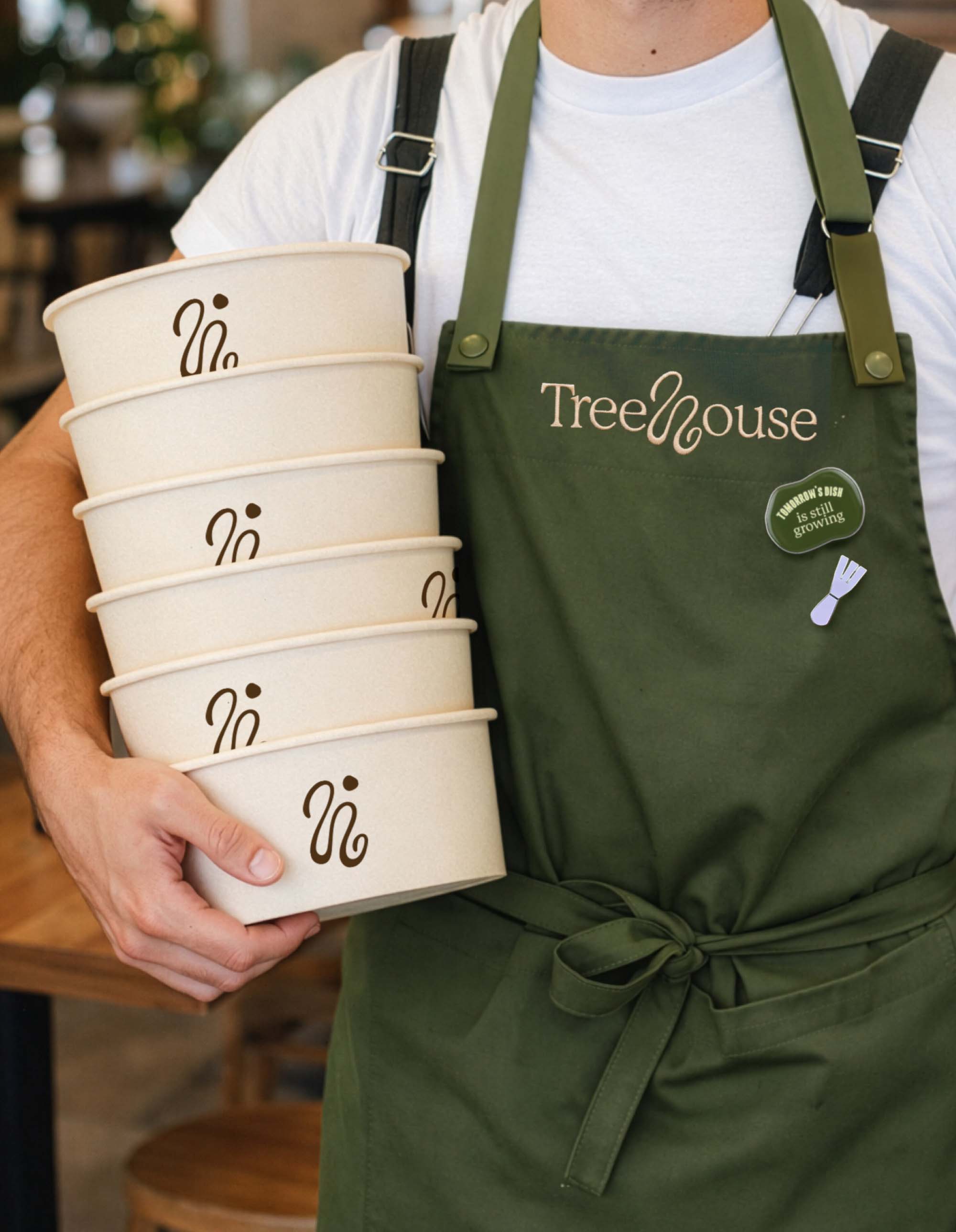
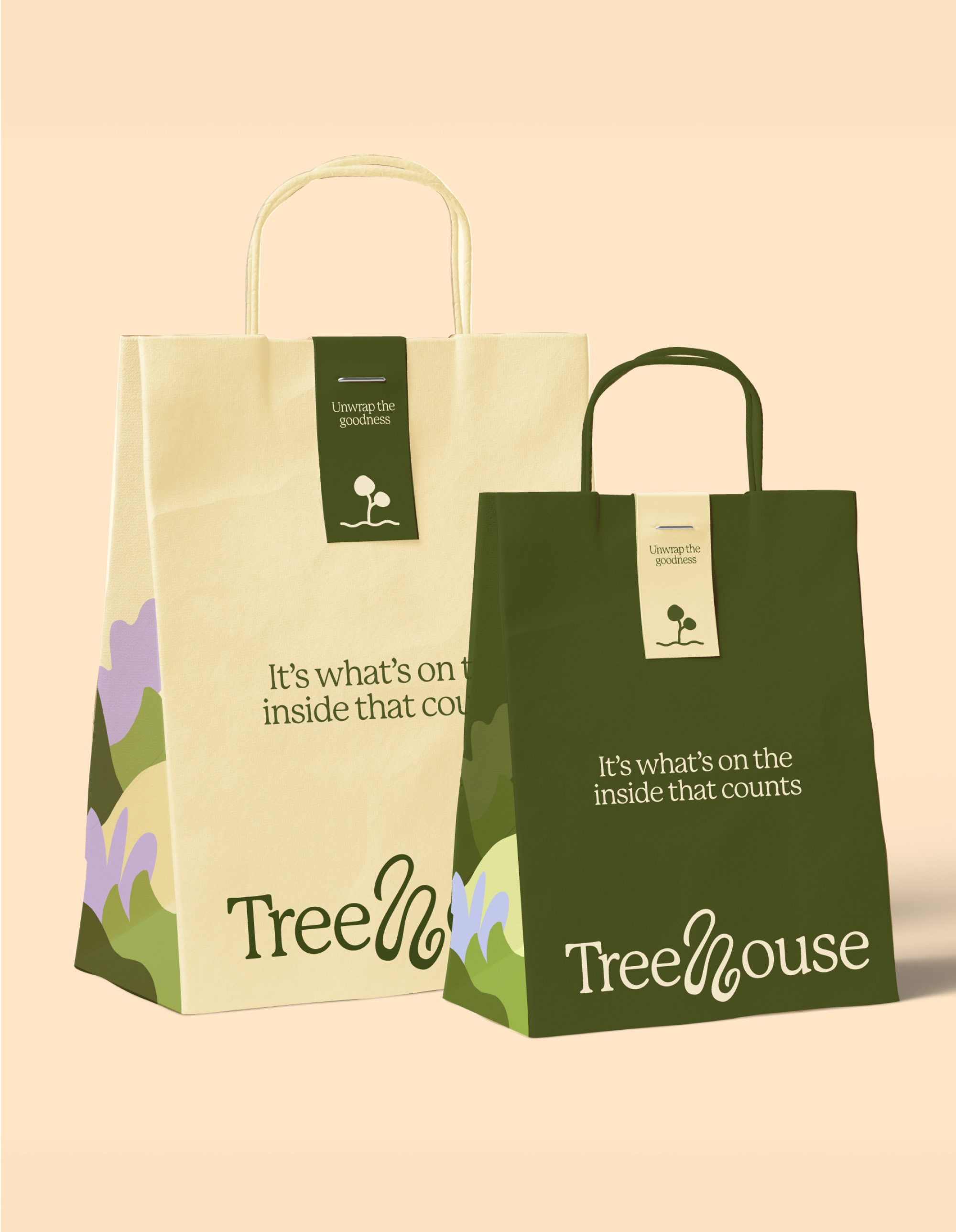
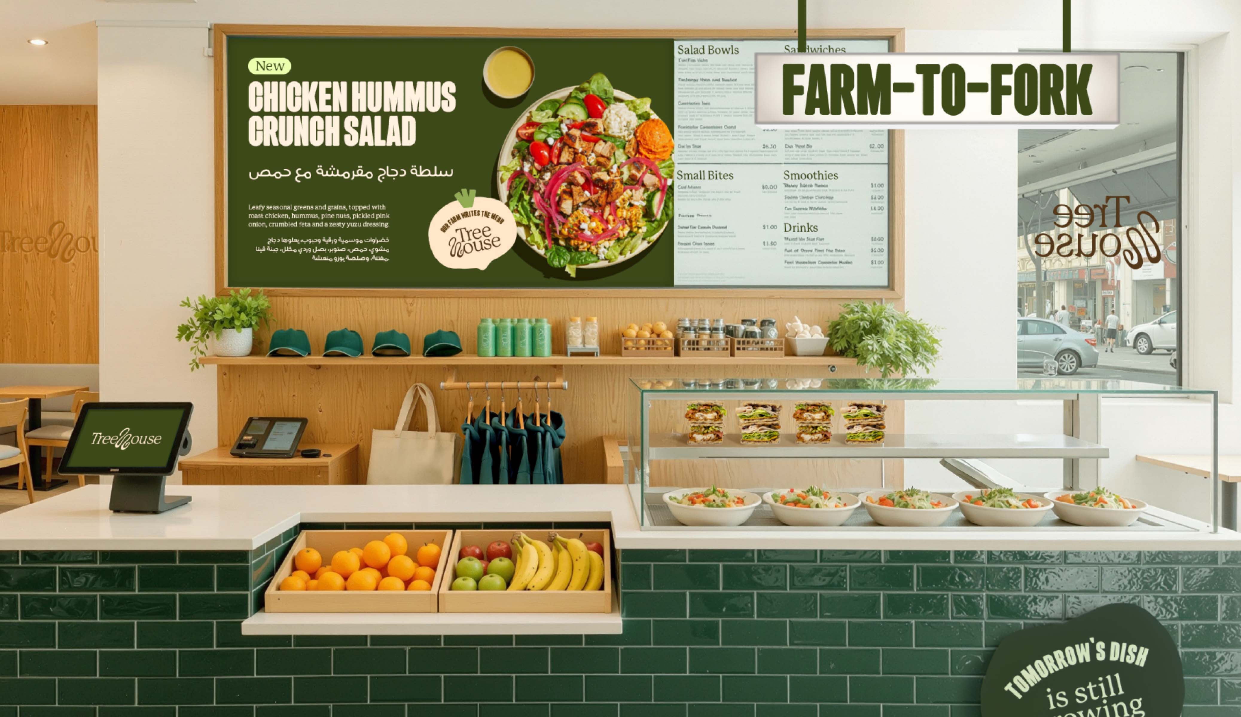
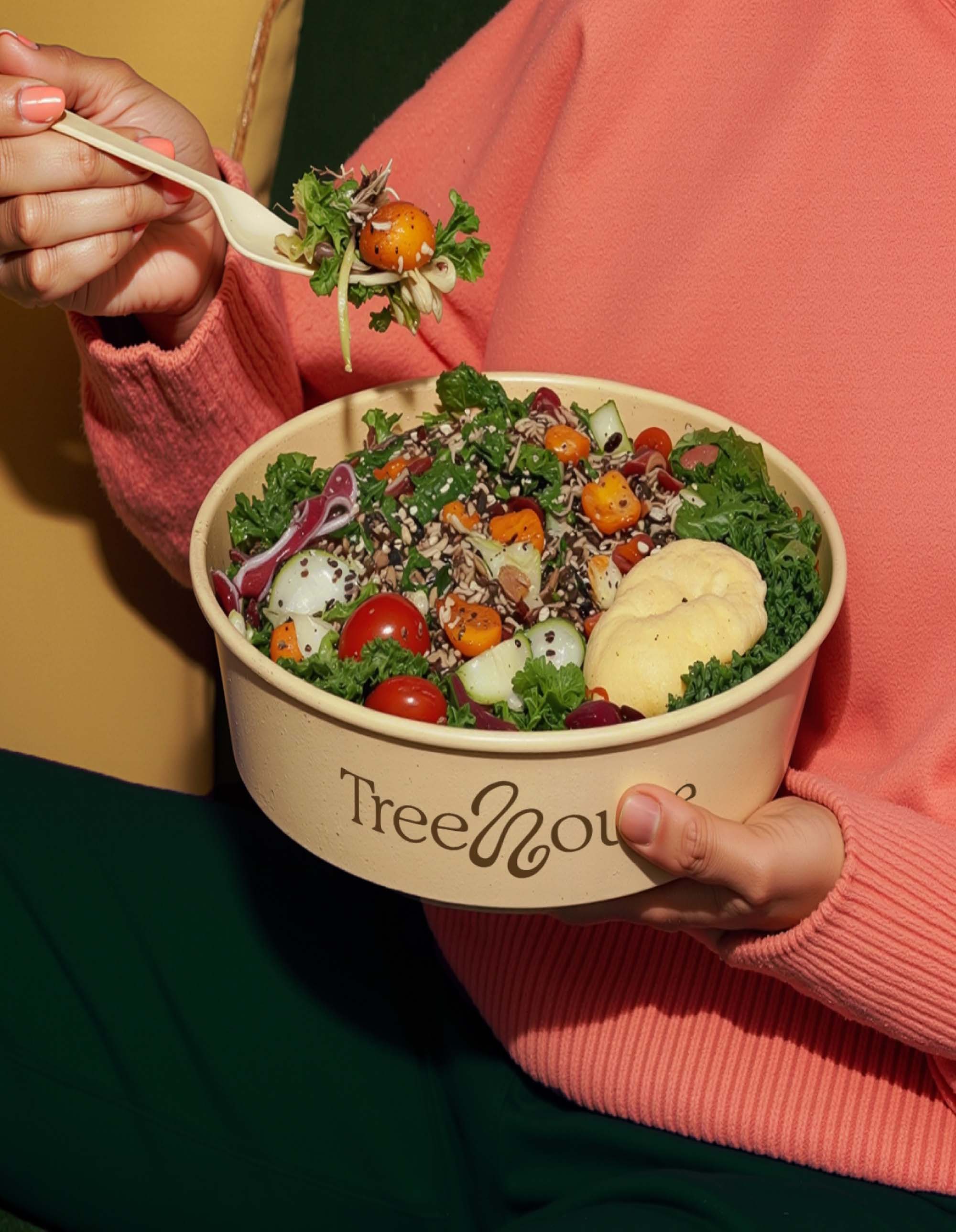
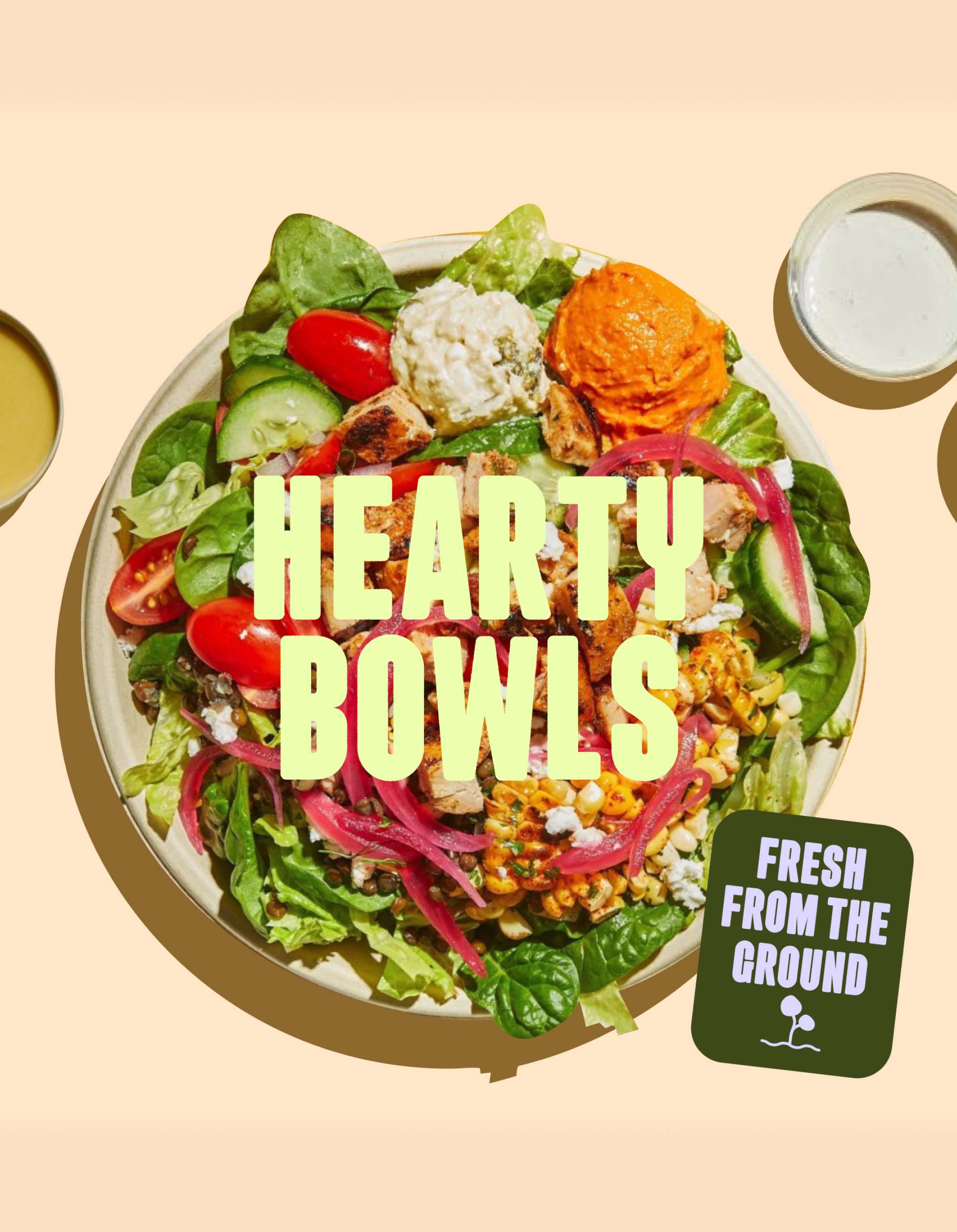
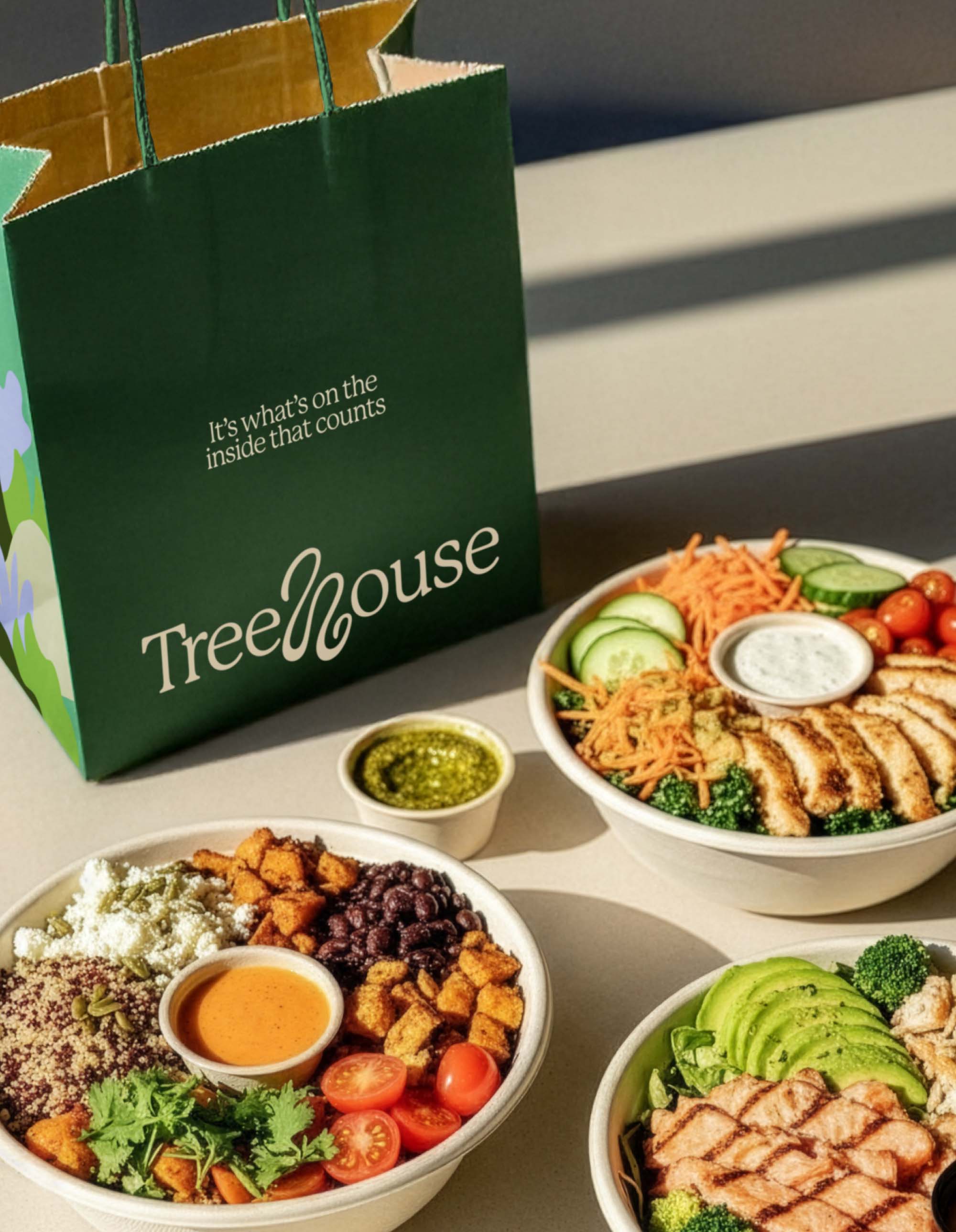
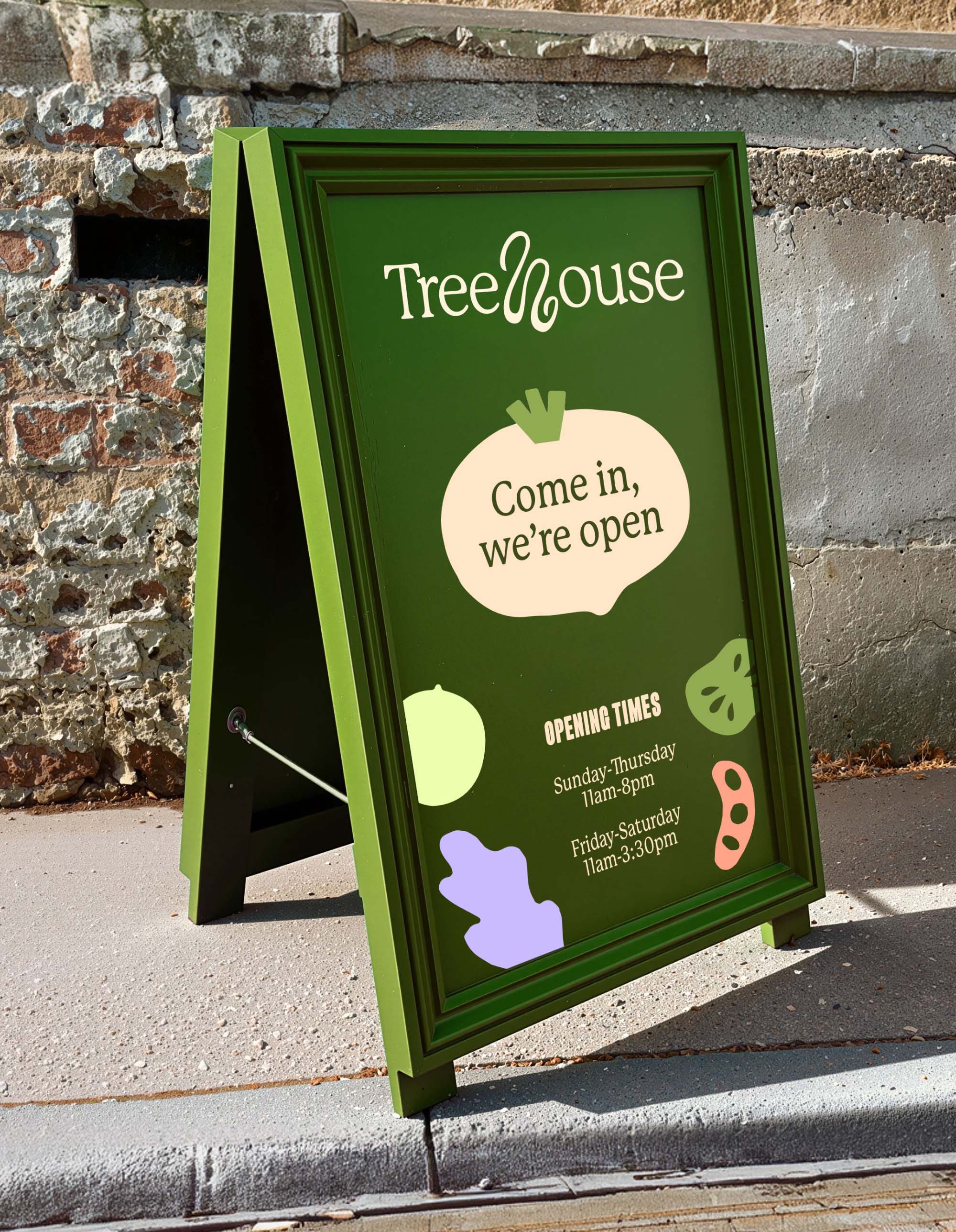
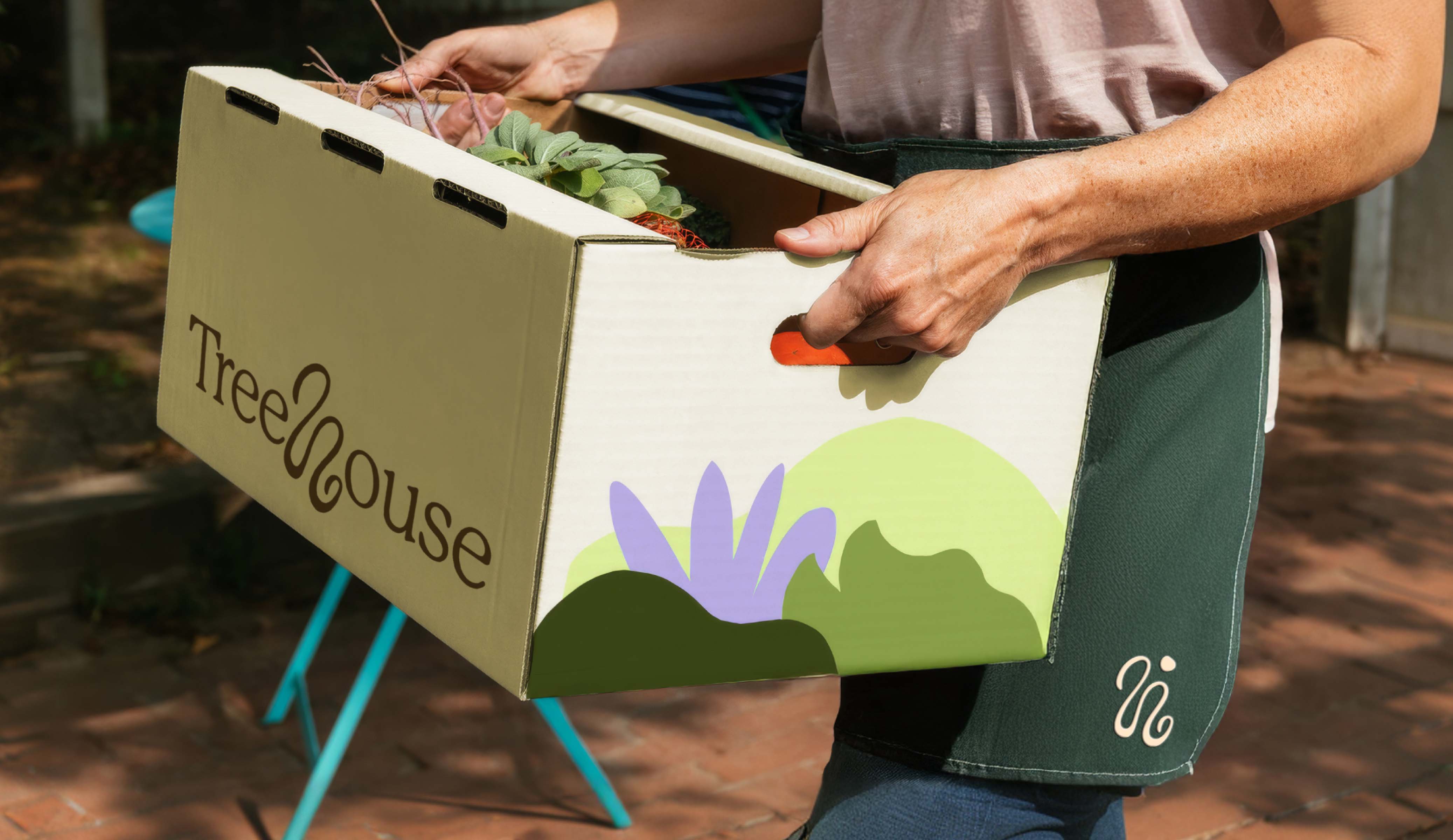
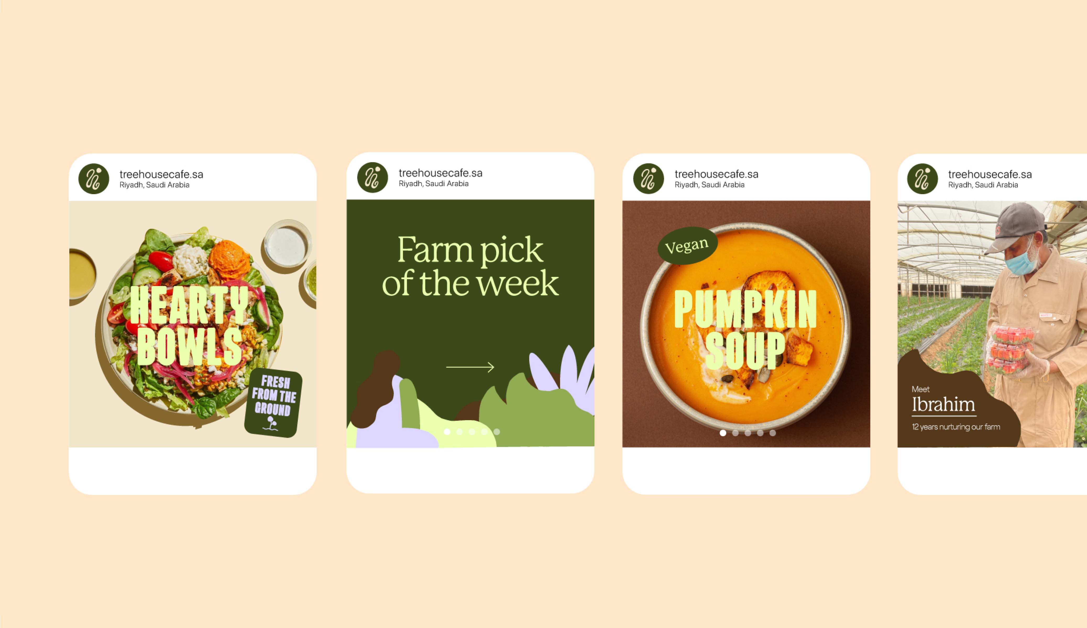
We built the brand narrative in the founder's voice, then translated it into a refreshed visual identity — an earthy colour palette, a refined logo with a distinctive "H" motif inspired by tree roots, hand-drawn typography and paper-cutout illustration. Applied across a new website, packaging and in-store touchpoints, the identity finally reflects the care behind the food it serves.