Menu

Working with JTI, we helped shape a new kind of nicotine brand for a modern consumer who sees nicotine less as a habit and more as a tool for focus, clarity and performance.
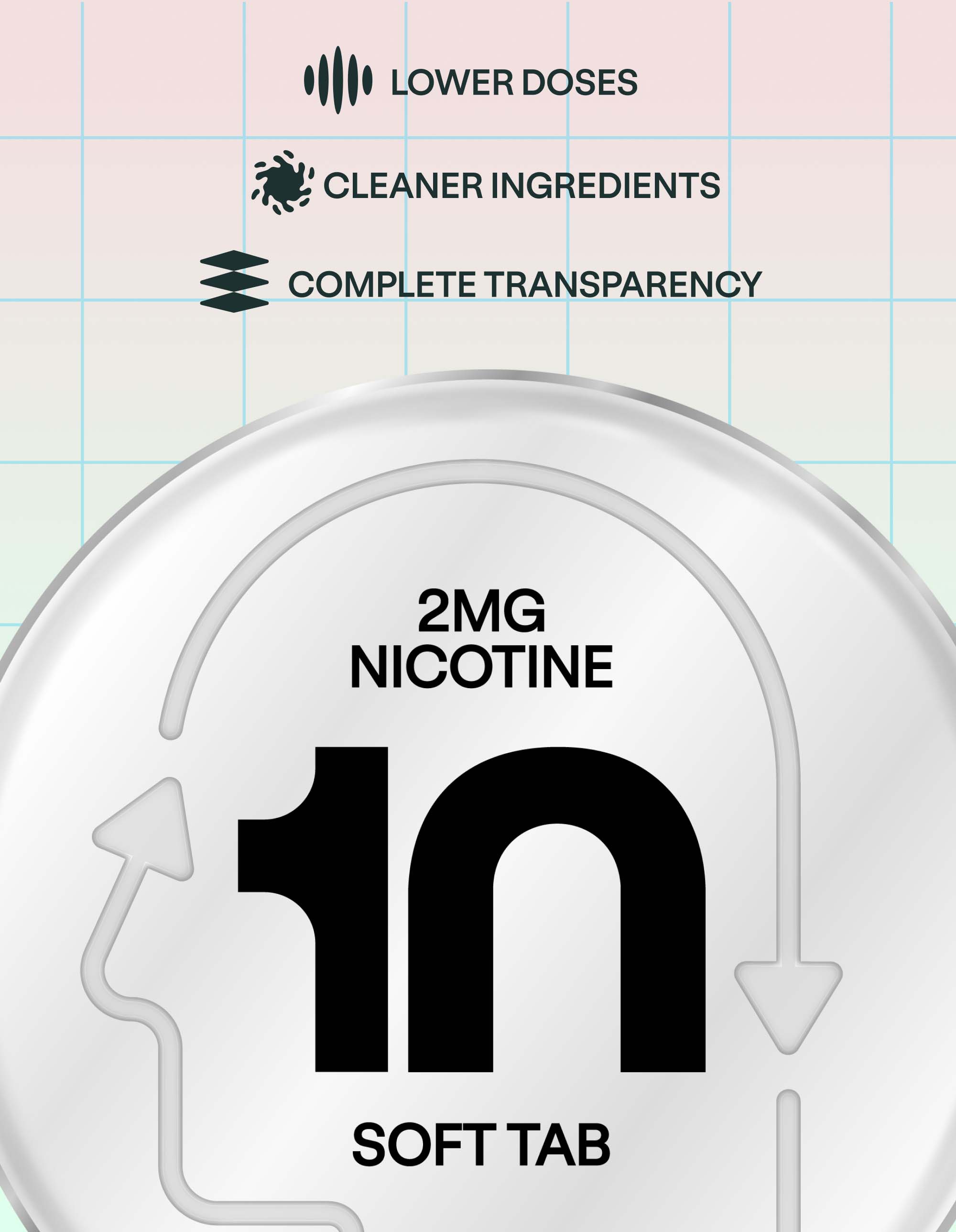
A new category of consumer is emerging. One that is deliberate, ambitious and uninterested in the outdated cues that have long defined the space. Our role was to reposition nicotine through a more premium and culturally relevant lens, making science feel desirable rather than clinical.
We created a brand world built around clarity, precision and control. Using GT Standard typography, a clean green-led palette and a stripped-back visual system, we developed an identity that feels sharp, confident and intentional across every touchpoint. The result is a brand that feels progressive, elevated and distinctly different from the rest of the category.