The Brief in Brief
The North Star
Build a brand and pack that shouts flavour and crunch - loud enough to turn heads, sharp enough to stick.
What Needed Doing
Create something that doesn’t just sit on shelf, but jumps off it. Crunchits needed to feel different, look delicious, and be impossible to ignore
The Slingshot
Wrap a healthier snack in a brand that feels more like a pub favourite than a health aisle compromise. Something you’d proudly order with a pint (and probably go back for seconds).
The Results
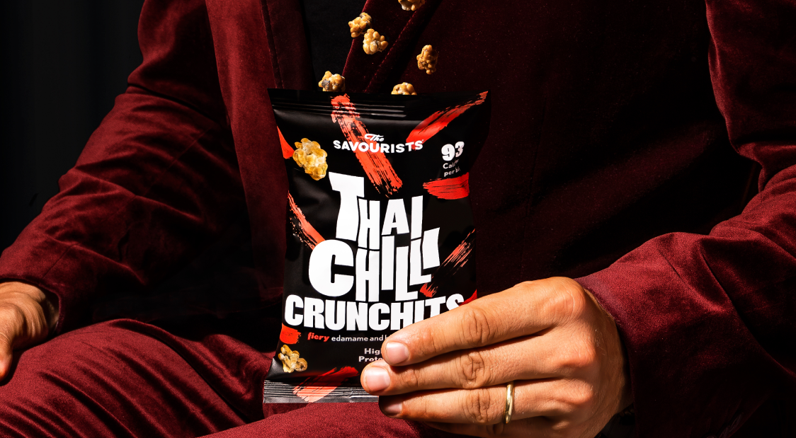
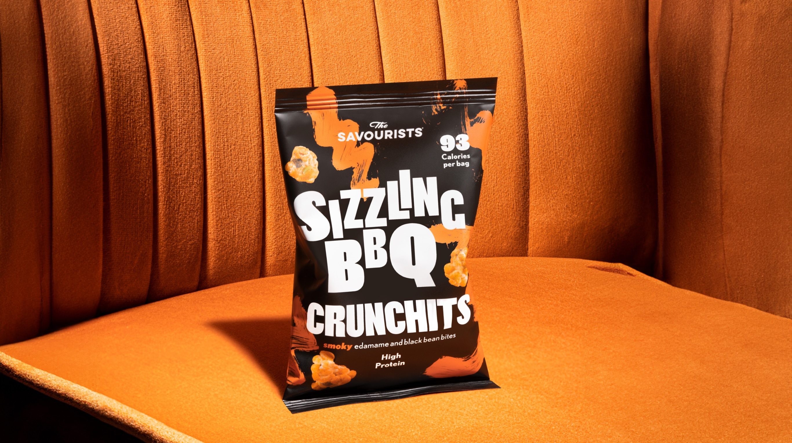
Packaging that Pops
We sweated the small stuff - from flavour cues to texture hints, to create a pack that looks as punchy as it tastes. The result? A design that does the talking (and the crunching).
Shelf Appeal
With bold colours, confident typography, and a flavour-forward attitude, Crunchits now stands out like a crisp packet in a sea of sameness and gets picked up just as quickly.
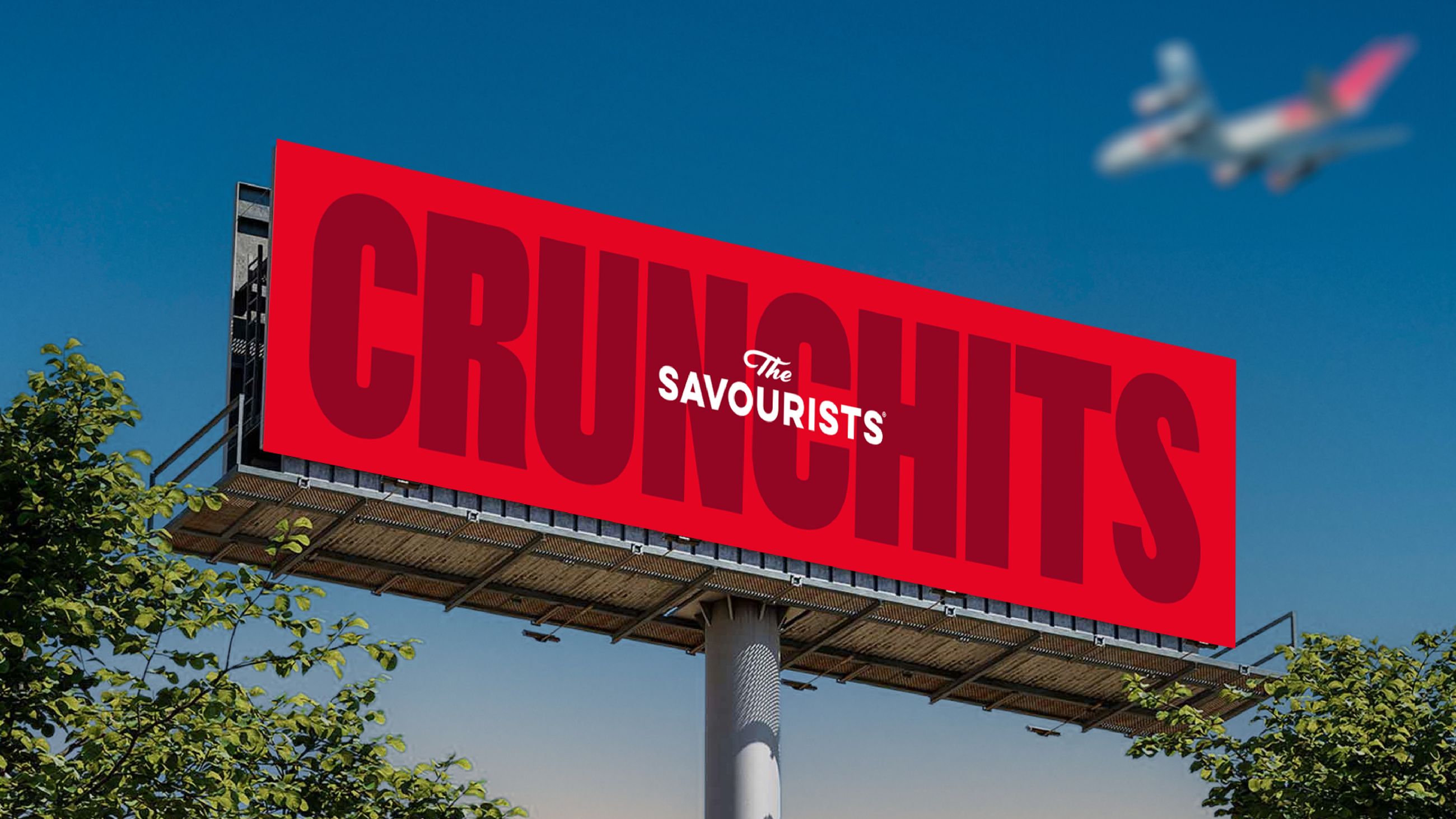
Taking Off
From prime placement on Ocado to becoming the one of the best selling snack on EasyJet, Crunchits didn’t just show up… it took off.


.jpeg)


